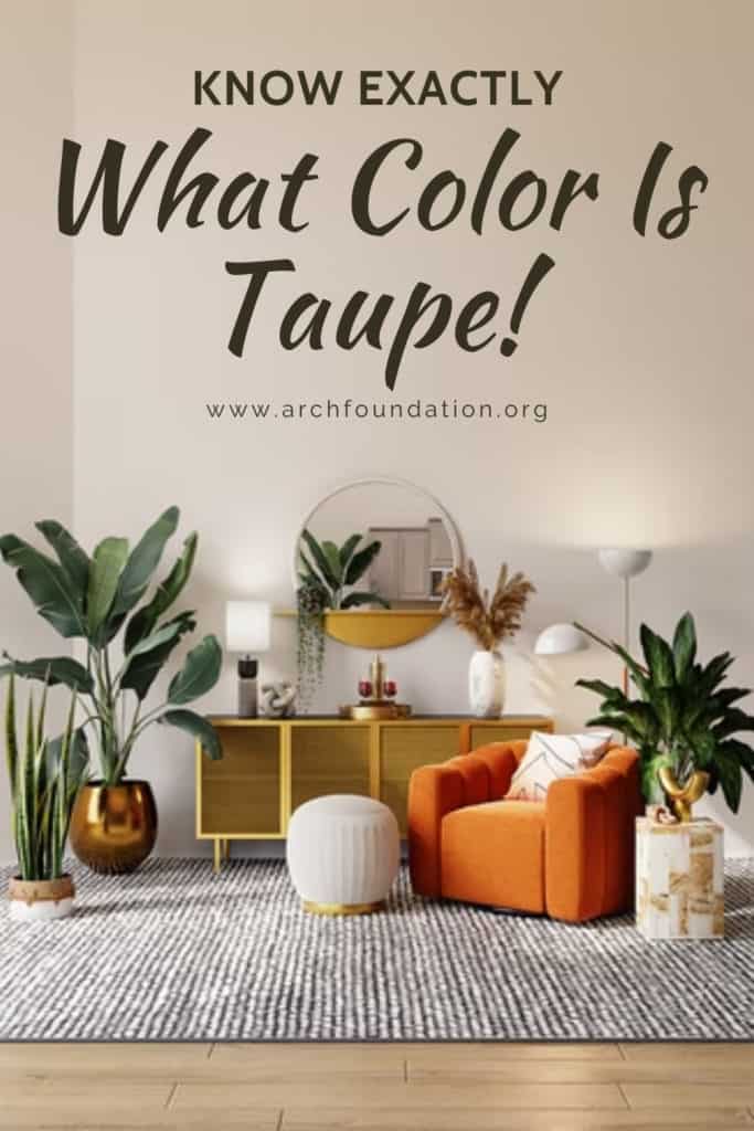
Know Exactly What Color Is Taupe!
To start with, taupe is one such versatile color with wide variations. It may be one of those colors which are hard to define but exist as a beautiful neutral color. So, what color is taupe exactly? The intermediate shade between gray and dark brown color is taupe. Well, it’s not a single color to end. You can find more than 100s of variations in such range.
The color makes the perfect accent and foundation for those who admire cozy feelings and traditional styles around their homes. Furthermore, it can be used in nearly every aspect of art and design, including fashion design, branding, home décor, and architecture.
It’s a natural neutral hue that is created by combining different complimentary colors. They can result in mutes or desaturated brownish colors. However, Taupe hues are made by a mixture of umber and white pigment. The origin of French word Taupe comes from the Latin word, Talpa, which can be translated to the mole and resembles the description of moleskin.
Notably, the taupe colors have been represented on Pantone Color Trends Reports for years. The color ‘Warm Taupe’ has also been featured on the color palette of ‘Fall 2016’. After all, it provides a decent backdrop to complement those offset brighter colors.
Different meanings of Taupe on the color wheel!
10 Different Shades of Taupe
Let’s discuss some renowned shades of taupe which are applied in bolder décor, backdrop, or simple, subdued shades. To understand this color better, we have collected almost 10 such color combinations. You can feel it warm with hints of red and cool with hints of green.
Threshold Taupe
This exterior taupe color nicely complements the pale lounge chairs and wooden roofs, if any, present in the home décor. It has more than 5 sub-shades to consider.
Greige
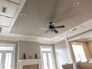
Greige is a mix of beige and gray color mixed to create an extremely versatile neutral hue with taupe. It represents a cozy medium and warm hue that looks amazing in any room. The color is also called light taupe trim, which plays the role of the monochrome palette that remains warm in front of other rustic accents.
Devonwood Taupe
Devonwood Taupe is a portion of Classic color collection. It is surrounded by other color favorites which are elegant, timeless, and beautiful, and remain usable all the time. The color is among the collection of 1,680 hues that professionals and consumers have admired for years.
Gotham
The color is a deep taupe with shifting daylight. It can also be found in a range of weathered gray and sepia. Yet, it continuously works in the whole picture of the Gotham Taupe range. You can call it a united kingdom of different gray undertones. It well contrasts with light and textured gray rugs and cool taupe curtains.
Shenandoah Taupe
The color is also known as Waynesboro Taupe. It is a good part of America’s favorite colors. The beautiful color palette provides a collection that ranges from pale gray tones of amazing coastlines to the rich and clean earth tones of the Southwest desert. It brings outdoors in a vintage and old-school world approach.
Flatiron
The youthful and sophisticated dining area, when included with lighting and statement mirrors, is somewhat backed by shimmery taupe walls and play up with a metallic accent. NYC neighborhood Clare HQ’s architecture basically inspires it.
The color represents a warm mix of beige and gray color to be beautifully immersed with natural light. It looks deeper when the sun sets and brighter during the day time.
Annapolis Gray
With this color, the walls will play off geometric flooring while other coastal wallpapers, if any, present in the home décor, will warm-up space. The color is also called as Annapolis Gray HC-176. This poised shade is somehow anchored in traditional colors.
Jitney
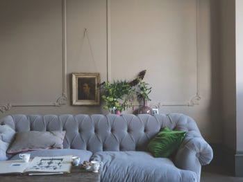
It’s a relaxed brown and dependent neutral hue taupe color that sits somewhere between Grey Elephant’s Breath and traditional Oxford Stone. Even though it is a mule, the color incredibly reminds of lazy as well as uplifting days by the sea.
If your architecture includes a statement custom bed and fun gallery wall, the color will look awful.
Ticonderoga Taupe
Ticonderoga Taupe is another part of Classic Color collection surrounded by other color favorites. The statement of art and modern furniture, when grounded with a neutral and warm palette, the tufted taupe color originates. It also includes vintage look upholstered in taupe velvet.
Smokey Taupe
Smokey Taupe is also a part of Classic Color Collection with other color favorites. A sanctuary like a bathroom always works best with these kinds of colors. It is made with a neutral palette and other natural materials. From velvety top walls to manila rope ceiling, it is formed with a sort of connection and tactile comfort when nature comes to life.
So, these are some variants of taupe from which you can create sub-shades as well.
Taupe’s Psychology
The psychology of taupe is considered to be neutral, timeless, authentic, basic, practical, modes, and organic. So, you cannot call it a trendy color because of timelessness and versatility. Lovers of taupe can fit in anywhere, and its warmth creates a kind of lift towards them.
On the other hand, lovers of taupe color can also be called as unexciting, dull, conservative, and cautious. Well, they are classic, dependable, and down to earth people as per taupe’s psychology. They generally tend to be at the center of attention and modest as well.
What Color Usually Goes With Taupe?
Taupe is one of the challenging colors also. Thus, it is best to find the right combination for such a palette. They may look similar, but each color or its range comes with different undertones.
Cool Palette Options
Taupe can easily call for both sides of the palette field, i.e., cool and warm. To make this scheme work, you have to choose a somewhat gray-toned, cooler taupe color with blue-violet and blue or green hints as to the base.
Furthermore, the theme is combined with small furniture pieces and other material accessories featuring cool pastels. The choices such as sky-blue, mint-green, and pale lavender are generally considered ideal in this aspect. On the other hand, white paint on wood gives refreshing and cool crispness with a cottage sort of feel.
Warm Palette Options
If you are looking to create an inviting and warm space using taupe, simply consider the tan-brown tones. As it’s an essential warm color, it pairs well with taupe pair and other warm range of colors such as olive or pink tints, and soft-yellow.
It is also recommended to use a variety of pink, yellow, or pastel pillows while using warm taupe for large furnishings or walls such as sofas. They also look great in small furnishings such as throws, lampshades, and rugs.
Bold Taupe Options
Even bold colors are used in the soft taupe palette. Just don’t leave the taupe behind and use the bolder colored approach in your décor. You have to think of base color options for this taupe scheme extremely.
Go either very deep or select pale shades of gray base or brown taupe rather than medium-range colors. Also, choose bold hues for textiles and accessories with the same basic warm or cool palettes. You can also go for plum, mustard, coral, teal, or pumpkin for unexpected colors.
Modern and Neutral Color Options
Just to contribute towards the room’s vibe, it’s better to combine taupe with certain other materials. Wood furniture can be combined differently with taupe than metal furniture. When this wooden furniture is changed to a metal one, an ultra-modern feel is provided with cool taupe palettes.
Minimal style with black and chrome leather against blue-gray tints of taupe walls and floors looks clean, functional, and practical as well.
Explore 15 Taupe Paint Colors that are best for the living room, kitchen, and so on! Watch this video below:
Different Uses of Taupe
Taupe can be used creatively over different things. Let’s look at its usage from various angles in flooring, bedroom, kitchen, walls, and so on.
On Wooden Flooring
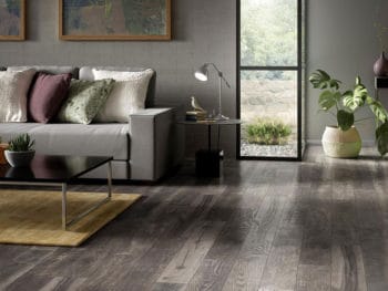
The use of taupe is commonly defined with wooden flooring. It represents versatility in such a neutral shade very effortlessly. Mixing pure white furniture with wooden flooring is the best part as it blends with natural warmth and texture. Moreover, you can add other decorative items and colorful rugs to let it pop out of décor.
On Ceramic Flooring
Ceramic tiles also best compliment the use of taupe color. You can either use it in a bathroom or kitchen flooring to stand a chance. For the great contemporary design, just pair it up with contrasting colors and minimal furniture. The color represents a kind of classic touch from those bygone years.
On Walls
Walls are another best contribution to the use of taupe in different ranges. They serve as an excellent background majorly for furniture and décor layout with the usage of various shade options. Just be careful, and don’t overwhelm the room’s balance. Count on some degree of certainty to offer a gentle tone.
In Fabrics
Use taupe in fabrics apart from walls and flooring with gorgeous looks in shade. The texture of fabric also plays an essential role in making furniture look more desirable and comfortable as well. For instance, a fluffy and taupe colored woolen blanket plays a just beautiful role with overall room décor.
In Bedroom
The bedroom is a soothing or, you can call, a comfortable place to start using taupe as there are no problems and worries here, so it’s best to represent your bedroom with comfort, tranquility, and relaxation as much as possible. Instead of using intense and bold color schemes, you should use something glamorous, as is provided by taupe.
In Kitchen
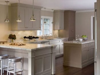
The last part I am going to discuss is a kitchen with versatility. The use of taupe color can also be found in busy places such as the kitchen, which will appear luxurious and appealing to the eyes. Make a rustic theme in the kitchen with a simple mixture of white weather flooring and wooden cooking vent.
Here are 24 more ideas to decorate interiors with taupe color! Let’s see this video:
Some Frequently Asked Questions
Given below are some commonly asked questions by users of taupe colors. Let’s take a look at each of these questions to get an idea of how things work in practice.
Conclusion
So, this is what color is taupe can be defined! After explaining the color, and its psychology, I had a way towards some frequently asked questions by users. The color is said to be neutral than specifically warm or cool. It can be found in both warm and cool undertones with more than 100s of range.
