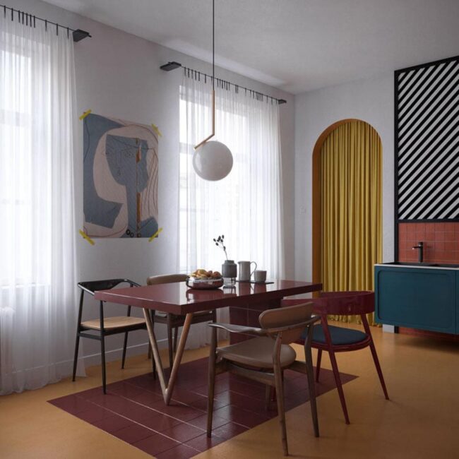
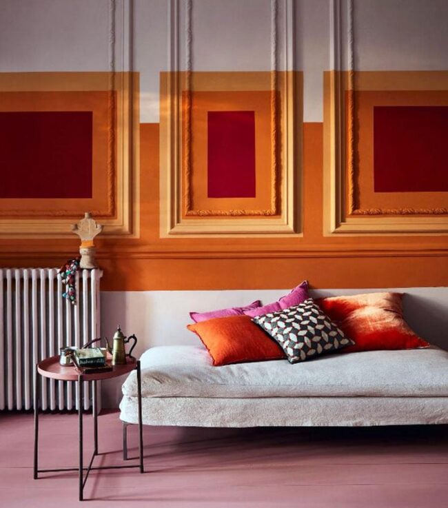
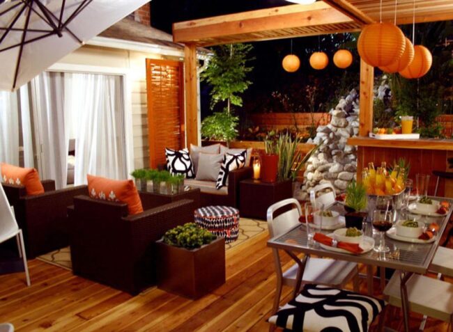
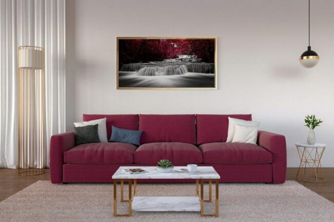
What Colors Go With Burgundy? 20 Beautiful Ideas
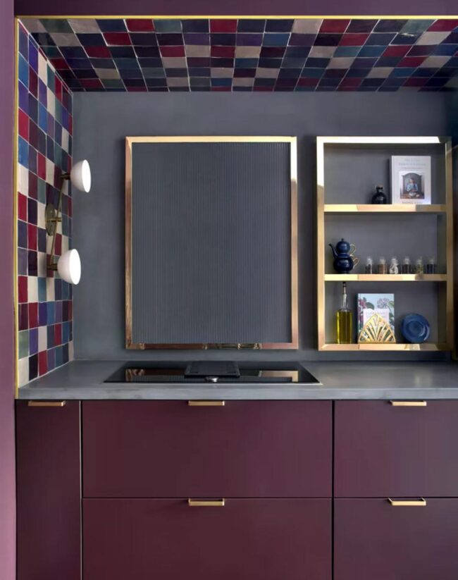
Colors that go with burgundy enrich this deep, vibrant shade, making it a popular choice for bold and sophisticated interiors. Complementary colors like gold, navy, and forest green can enhance burgundy's richness, providing a luxurious and cohesive look.
Experiment with colors that pair well with burgundy to bring elegance and depth to your decor. Utilize these combinations to elevate your living space with a regal touch.
20 Best Colors to Pair with Burgundy
Discover how to pair burgundy with 20 stunning colors that enhance its rich, deep hue. From soft pastels to bold neons, see which colors create perfect harmony with burgundy.
Navy Blue
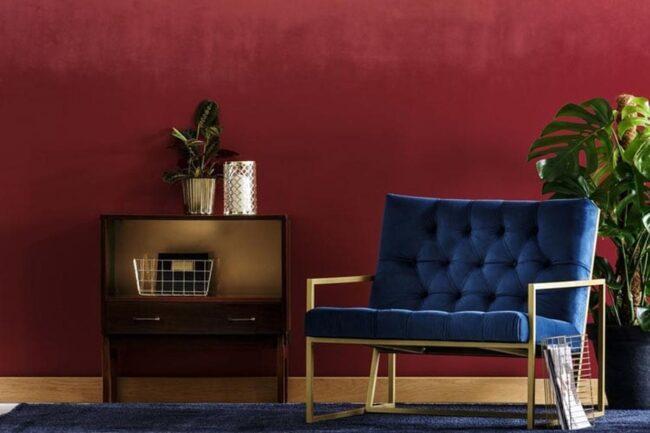
Navy and burgundy create a beautiful mix that adds class to any room. Rich colors like these make a striking impact when paired together, bringing elegance into your space.
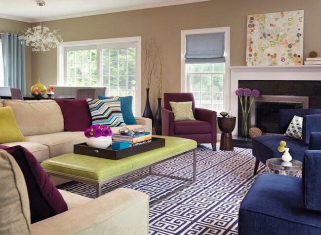
The deep tones work well with lighter shades such as eggshell and white, allowing for eye-catching contrast. Traditional designs often feature navy and burgundy Oriental rugs alongside cream-colored furniture to enhance warmth on glossy wood floors.
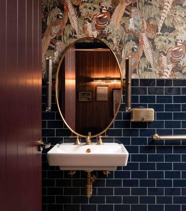
Vintage styles shine too; imagine transforming a powder room with herringbone floor tiles in navy blue matched with geometric wallpaper in burgundy and gold from the art deco era. This combination breathes life into simple interiors while showcasing unique tastes.
Brown
Warm and earthy, brown instantly brings coziness to any space. This color pairs beautifully with burgundy since burgundy has strong brown undertones.
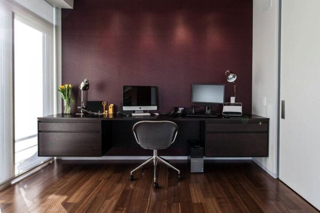
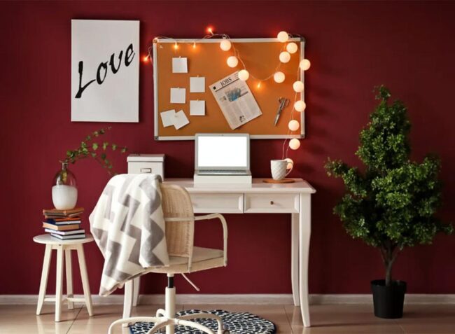
A masculine office can shine with dark wood furniture in shades like mahogany or cherry, complemented by a wool rug featuring hues of burgundy and sepia. That combination creates a sophisticated atmosphere for work or relaxation.
In a tan living room, adding decorative accents like throw pillows and artwork in burgundy brightens the mood significantly. A camel-colored rug adorned with a simple burgundy branch pattern ties everything together seamlessly.
Black
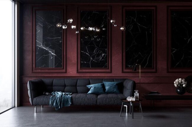
Dark and dazzling, black serves as a neutral shade that pairs well with every color. This versatile tone creates bold visual statements in interior design, especially when combined with burgundy.
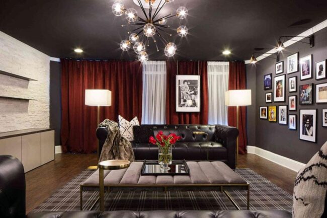
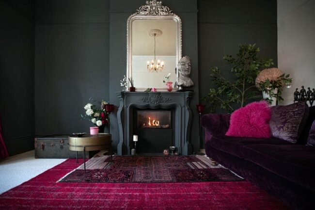
Together, these colors form a striking duo that captures attention. In spaces meant to be dark and cozy, such as home theaters or dens, black paint alongside plush burgundy furniture transforms the atmosphere beautifully.
A gothic bedroom can emerge from this scheme too; think of floral wallpaper in rich tones paired with ornate wooden pieces and an antique chandelier for a romantic feel. The dramatic impact of black and burgundy is both stylish and inviting.
Charcoal
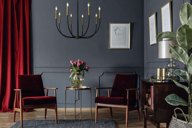
Charcoal leans toward black on the color wheel, offering a brighter option for design. This shade has a slight blue tint, creating harmony when paired with gray tones.
Burgundy stands out as a gender-neutral choice while charcoal often feels more masculine. Using these two shades together works well in modern spaces like industrial lofts.
A faded red brick wall can come alive again with cleaning and a special clear coat that enhances its warmth towards burgundy. For comfort, layer soft burgundy rugs over polished charcoal cement floors where you usually walk barefoot alongside sturdy wrought iron light fixtures to finish the look beautifully.
Gray
Gray stands out as a stylish and timeless choice for any room. Many trendy colors fade quickly, but gray remains relevant over time.
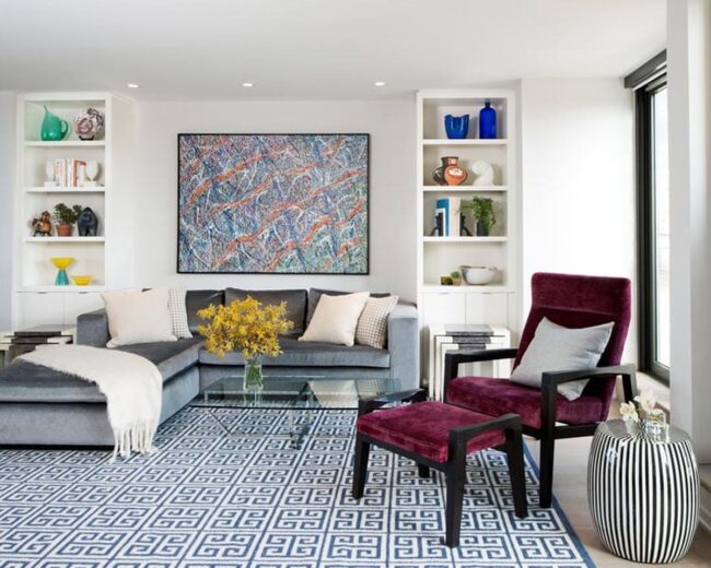
Experimenting with both light and dark shades offers endless possibilities for your spaces like the bedroom or living room. Some prefer softer grays such as smoke and gunmetal due to their flexibility, while others fear too much gray might create a dull atmosphere.
Adding bold colors like burgundy can bring life to the decor, creating exciting contrasts throughout your home. Statement pieces such as an abstract rug paired with geometric throw pillows can refresh your space instantly.
White
White reflects natural light, creating a bright and open feel in any room. This popular color works well with almost every design style and can blend beautifully with other colors.
Crisp white surfaces offer a fresh appeal but may risk making spaces seem cold if overused. To bring warmth back into your home, consider adding bold colors like burgundy for contrast.
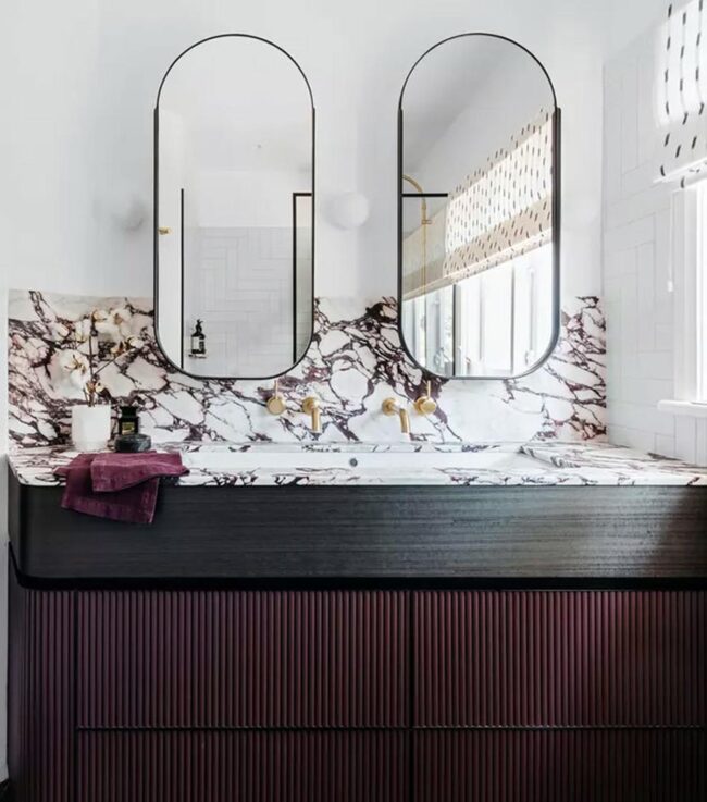
A bathroom featuring only white might appear clean but could lack charm. Introducing burgundy tiles in an eye-catching pattern can breathe life into otherwise dull areas, giving them personality and vibrancy.
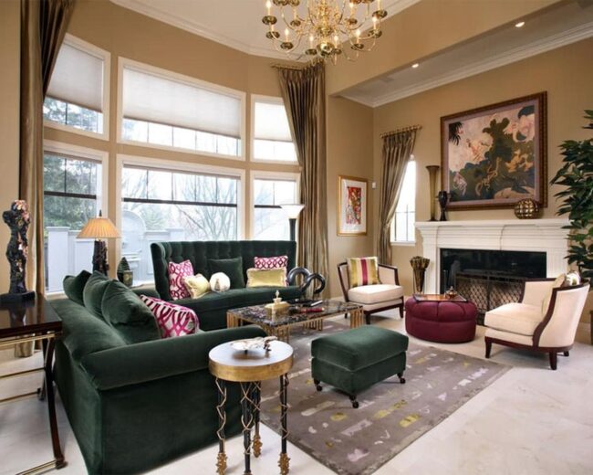
Green
Shades of green bring a sense of freshness and calm to your home. They help create a feeling of being grounded and connected to nature.
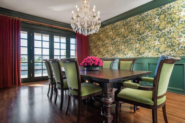
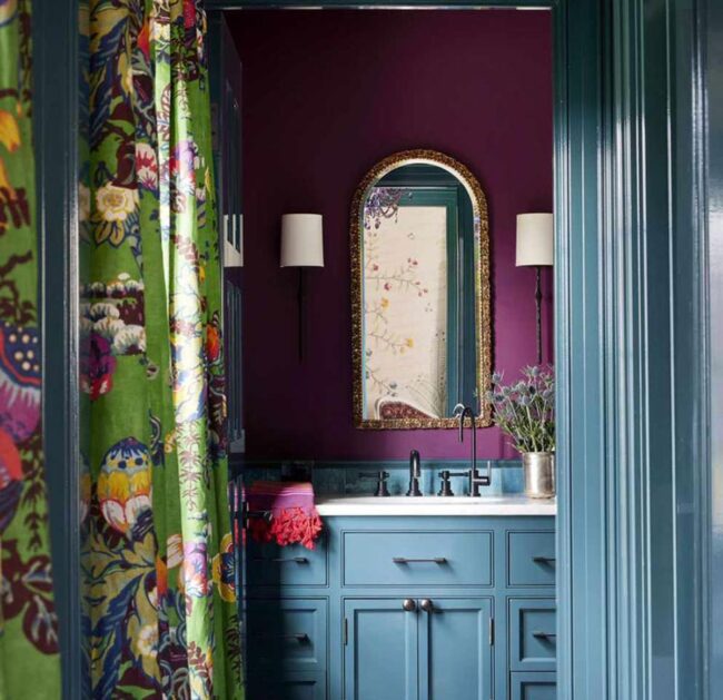
A traditional Craftsman-style home often uses earthy reds and greens, making this color combination appealing. Combining burgundy with olive or sage green can add depth when using botanical wallpapers inspired by William Morris.
Busy patterns work well in rooms with wainscoting, preventing them from feeling too crowded. Natural wood wainscoting enhances the classic look, while painting it in the same shade as the wallpaper offers a modern twist that keeps things fresh.
Blue
Many colors owe their existence to blue. This primary color, alongside red and yellow, forms the basis for a staggering array of hues—experts suggest up to 18 decillion variations. Without blue, shades like burgundy would not be possible.
Interior design often embraces blue because it brings a sense of calm and peace.
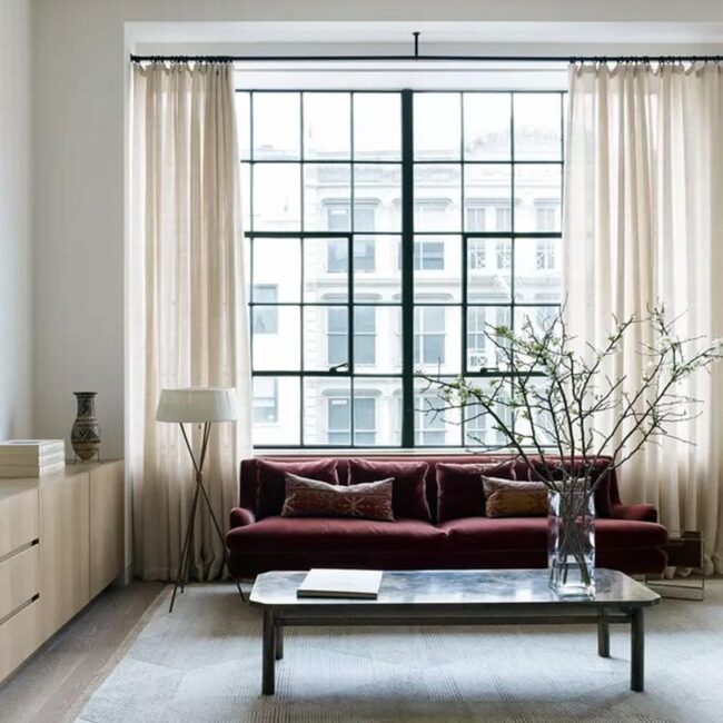
It pairs beautifully with bold colors while standing strong on its own. A living room painted in deep lapis can create warmth when accented with plush burgundy velvet furniture.
The result is an inviting space that feels both rich and luxurious.
Pink
Pink often divides opinions, but it is undeniably a striking color. Many view pink as feminine, leading to mixed feelings about its popularity.
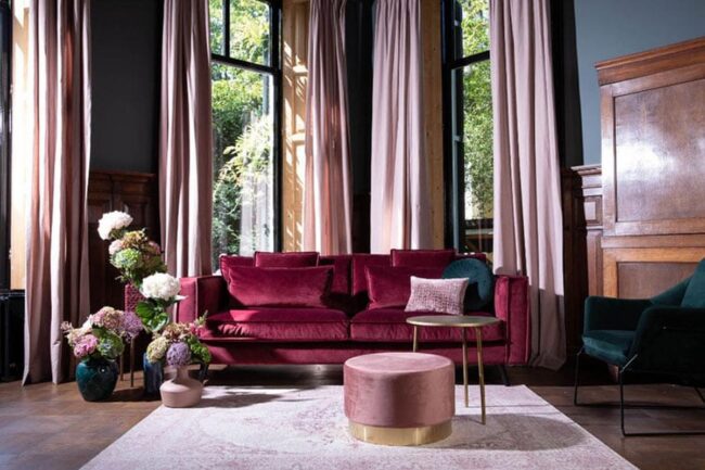
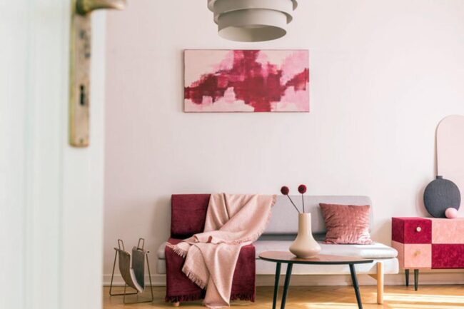
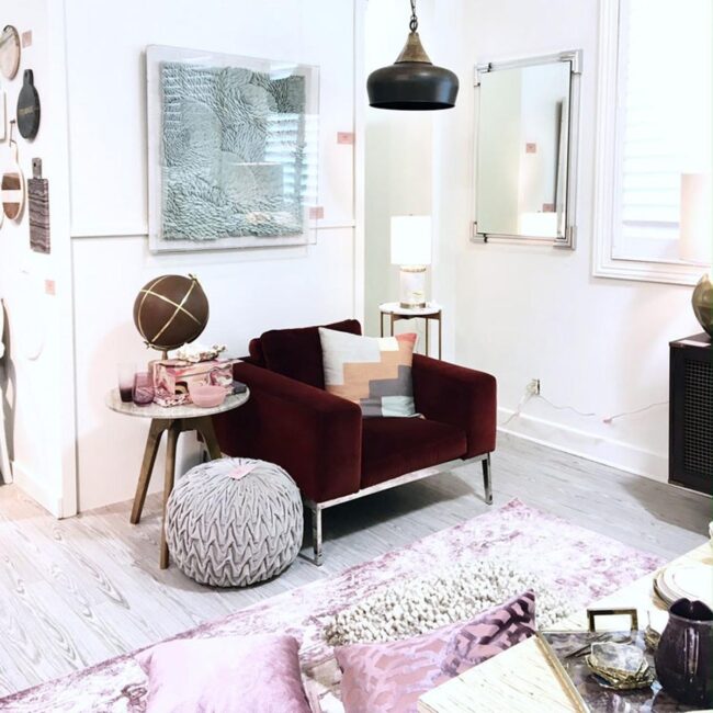
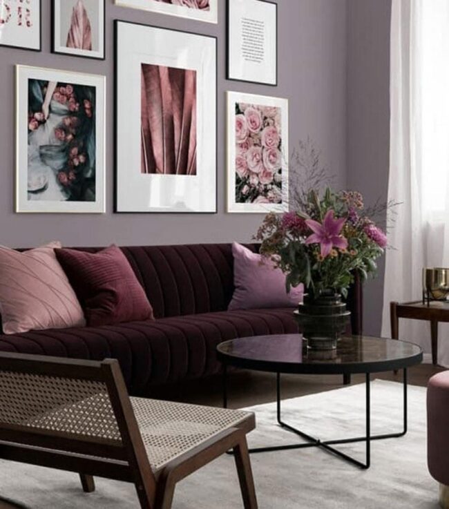
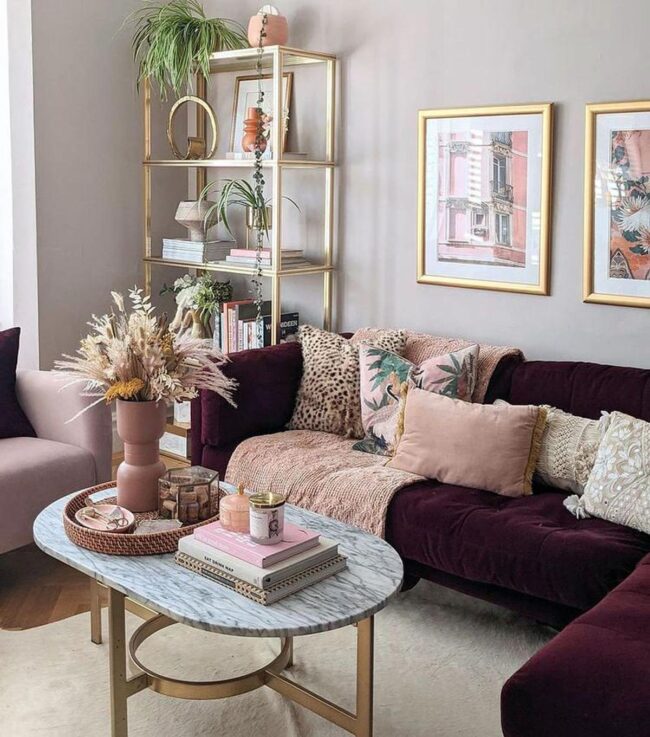
Cool undertones in burgundy allow it to blend well with soft and muted shades of pink. Dusty pink pairs beautifully with the brown tones found in burgundy, creating a harmonious look.
Agate-inspired area rugs are currently popular and add a modern touch to spaces. Choose one featuring colors like dusty pink, burgundy, and mauve quartz with elegant gold accents for a stylish statement piece.
Mint
Patinaed copper can add a unique touch to your kitchen. The greenish-blue color, known as verdigris, creates a beautiful contrast with burgundy and mint.
Mixing these colors might seem unusual at first, but they complement each other well. Mint is a soft shade created by blending green and blue with white, sharing similarities with the patina on copper.
This whimsical hue pairs nicely with the rich tones found in burgundy. Consider pairing a mint green glass mosaic backsplash featuring hints of burgundy alongside that stunning copper range hood for an eye-catching look.
Purple
Rich and regal, the color purple has long symbolized wealth and royalty. Many people hesitate to use it in their homes, fearing it might be too bold.
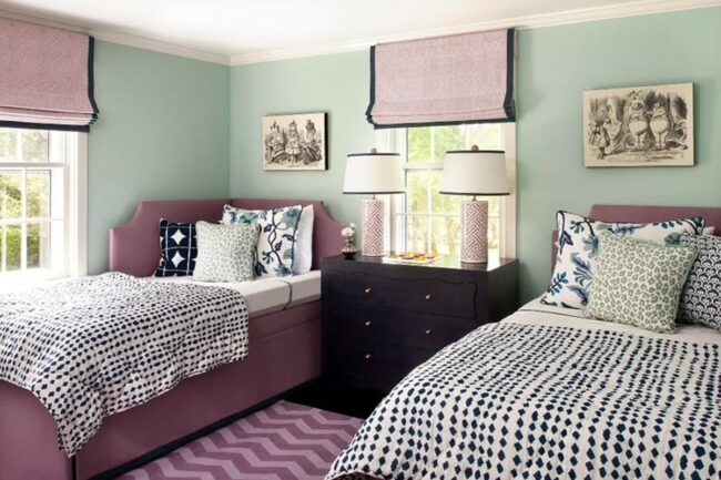
Unlike colors such as blue or green, purple is not a common choice for decor. Pairing similar shades like purple and burgundy can add depth without overwhelming a room.
This contrast creates visual interest that enhances interior design. Consider starting with a feature wall using abstract watercolor wallpaper in these hues; the soft print allows dark tones to blend gently into your space.
Teal
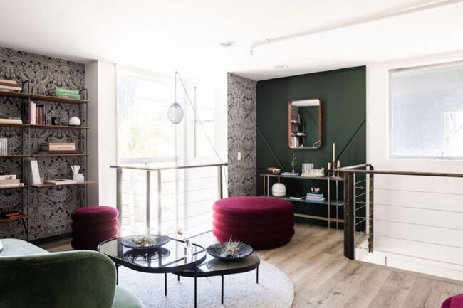
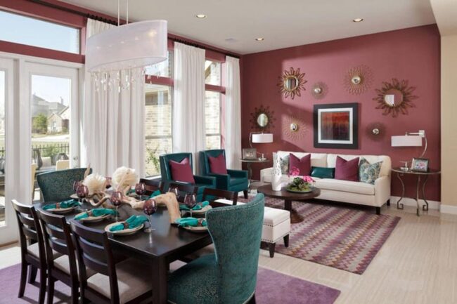
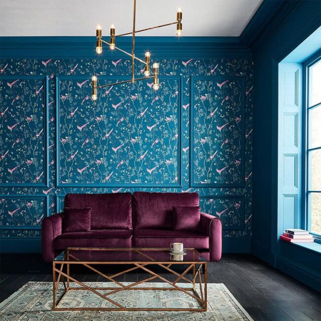
Maximalist decor loves bold colors and mixed patterns, making teal a popular choice. This deep blue-green shade pairs beautifully with burgundy, creating a striking look that adds depth to any room.
Teal often appears in vibrant spaces, like bedrooms featuring teal walls and curtains adorned with botanical prints. Understanding the differences among teal, turquoise, and aqua helps you choose the right hue for your space.
Aqua is light and airy while turquoise sits between those two shades. Teal stands out as a rich jewel tone that can enhance your home’s style effortlessly.
Yellow
A multicolored floor pouf adds a playful touch to your space. Layering textures through textiles brings warmth and depth to the room.
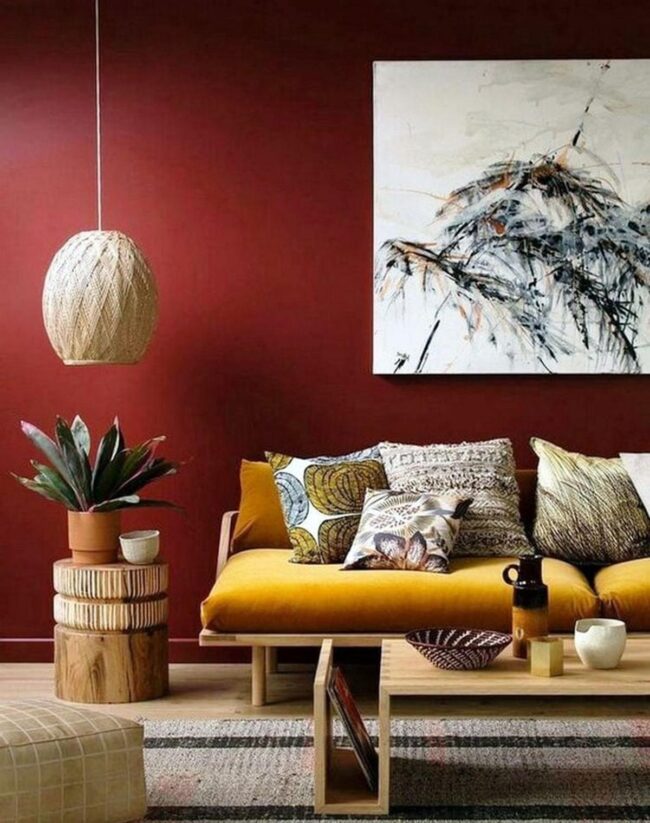
Mustard yellow floral print curtains stand out beautifully against a deep burgundy velvet couch. This combination creates an inviting atmosphere that feels both cozy and lively.
While classic Bohemian design leans toward bold colors, today's trend favors warm neutrals for balance. Pairing mustard yellow with darker hues like burgundy enhances their earthy charm, making any home feel vibrant yet welcoming.
Orange
Strong and energetic, orange catches the eye and commands attention. This color plays a key role in safety items like traffic cones and vests, ensuring visibility for everyone.
Many view orange as too bold, making it less popular in home decor alongside pink. With thoughtful pairing of colors, this hue can actually look stylish.
In interior design, burgundy works beautifully with orange to create an exotic yet warm atmosphere. Those who appreciate Middle Eastern style can bring that essence home by using burgundy walls paired with an overdyed orange rug and vibrant Moroccan lanterns.
Such choices make any space inviting while showcasing unique flair.
Beige
Versatility defines beige as a neutral color. A soft touch of this sandy shade can transform an all-white room, making it warm and inviting without losing its simplicity.
This hue also balances bold colors like burgundy beautifully. Mixing brown and white creates this classic tone, which features gentle yellowish undertones that add warmth to any space.
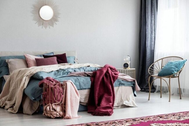
With the rise of eclectic design styles, stepping outside comfort zones has become more common for many homeowners. Introducing hints of burgundy through items like linen drapes or decorative pillows helps push personal style boundaries effortlessly.
Cream
Cream brings a soft, warm touch to any space. Its gentle yellow undertones give it a richer feel compared to plain white.
This shade works well with strong colors like burgundy, balancing them beautifully. Pairing cream with burgundy creates an inviting atmosphere without being too formal or harsh.
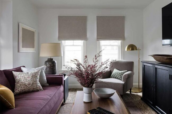
A creamy linen sofa looks great next to a distressed area rug that features both shades. Using these colors together enhances the overall look of your home while keeping things cozy and stylish.
Peach
Captivating colors always catch the eye, and peach stands out. This lovely shade comes from mixing orange, yellow, and white.
Peach ranges from soft tones to bright hues, making it versatile for various designs. When paired with burgundy, peach shines even brighter due to their natural connection.
A modern boho style thrives on this combination of softer shades alongside vibrant accents. Consider painting your bedroom walls in a light peach color and adding bedding or rugs that include bolder peach tones mixed with hints of burgundy for a cozy atmosphere.
Gold
Gold shines brightly as a luxurious color that instantly enhances any space. Small touches of this metallic yellow can create an upscale feel, while too much gold might seem overdone.
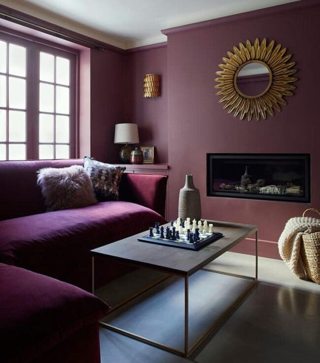
Pairing gold with deep colors like burgundy adds richness and depth to the design. An elegant powder room stands out beautifully with burgundy grasscloth wallpaper and a chic round mirror framed in gold.
This combination leaves a lasting impression on guests without overwhelming the senses. Using gold wisely allows you to achieve sophistication effortlessly.
Bronze
Bronze brings a touch of class to your space. This unique mix of brown and orange creates an elegant, vintage vibe that stands out without being too flashy.
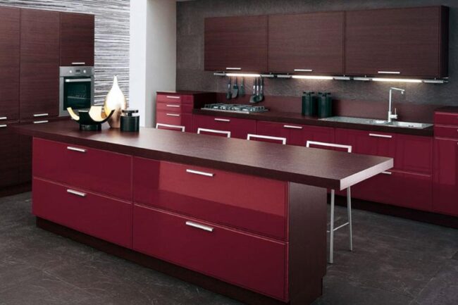
Using bronze in a burgundy room adds warmth and sophistication while keeping things subtle. Shades like burgundy stimulate the appetite, making them great for kitchens and dining areas.
A dining room can feel more refined with damask wallpaper in deep burgundy paired with an ornate bronze chandelier. Together, these elements create a rich atmosphere perfect for meals with family or friends.
Greige
Greige sits beautifully between gray and beige. This color blends the cool, sleek look of gray with the warm, comforting tone of beige.
Many find this modern hue appealing for its ability to fit into various styles effortlessly. An abstract painting in shades of greige accented by a touch of burgundy can become a stunning focal point in your home office.
Such artwork adds character while keeping the space neutral and inviting. Choosing greige brings both warmth and sophistication to any room you design.
What Are the Complementary Colors for Burgundy?
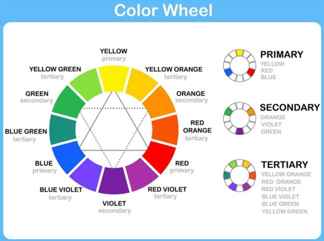
In science, green is the perfect match for burgundy. To brighten up this rich red shade, you might try a blue-green like teal or go for a deeper, moodier vibe with forest green.
Using colors that are opposites on the color wheel, like these, brings out the best in each and makes your space more visually exciting.
Which Colors Match Well with Burgundy?
Burgundy pairs beautifully with many colors, including navy blue, green, white, brown, beige, purple, gold, black, gray, peach, orange, and yellow. These combinations can warm up your decor, making it cozy and inviting.
Burgundy works great as an accent color in your home, helping to enhance the overall look without overwhelming the space with too much intensity.

